Home / Blood / Planet Earth II
What—
Three personal stories— Home / Blood / Planet Earth II— told through an 80 page illustrated book and physical component. The physical component, a large walnut container, has an interior segment that relates to each story, embodying either a key emotion or theme.
(Full stories can be found at the bottom of this page)
Why—
While each story attempts to tackle various different (and often abstract) topics, the consistent, underlying subject is womanhood. Through this work I sought to understand my own identity more clearly while also creating a piece that woman could connect with through shared experience.
How—
The bound book uses Prismacolor pencil drawings and handwritten text to create a sense of intimacy and imperfection— allowing the reader to connect to the content in a more human-to-human manner, as if getting a glimpse into a journal.
The walnut chest uses highly abstract components aiming to represent my own interpretations of the underlying forces at play within the stories. The open ended nature of these segments ideally act as a window of reflection for a viewer.


General Intent—
The visual style of this book incorporates quite a lot of blank space. While formatting it there were spreads that felt like they had the potential to be a bit more chaotic, however, I felt that the overall reflective quality white space brings was more fitting to the overall intent of the book.
All of the stories are written in first-person, I wanted the book to read as a stream of consciousness / self reflection / well-refined journal as opposed to a more removed account. The intent behind the first-person narrative style paired with the obviously hand-drawn illustration and handwritten text was to personify the events, placing the reader directly in my shoes.


Home—
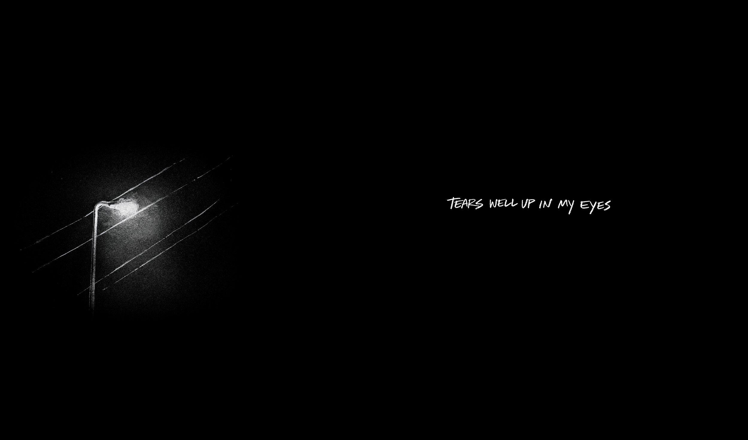
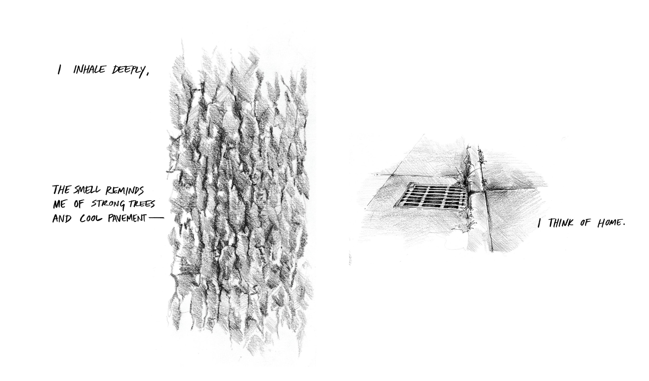
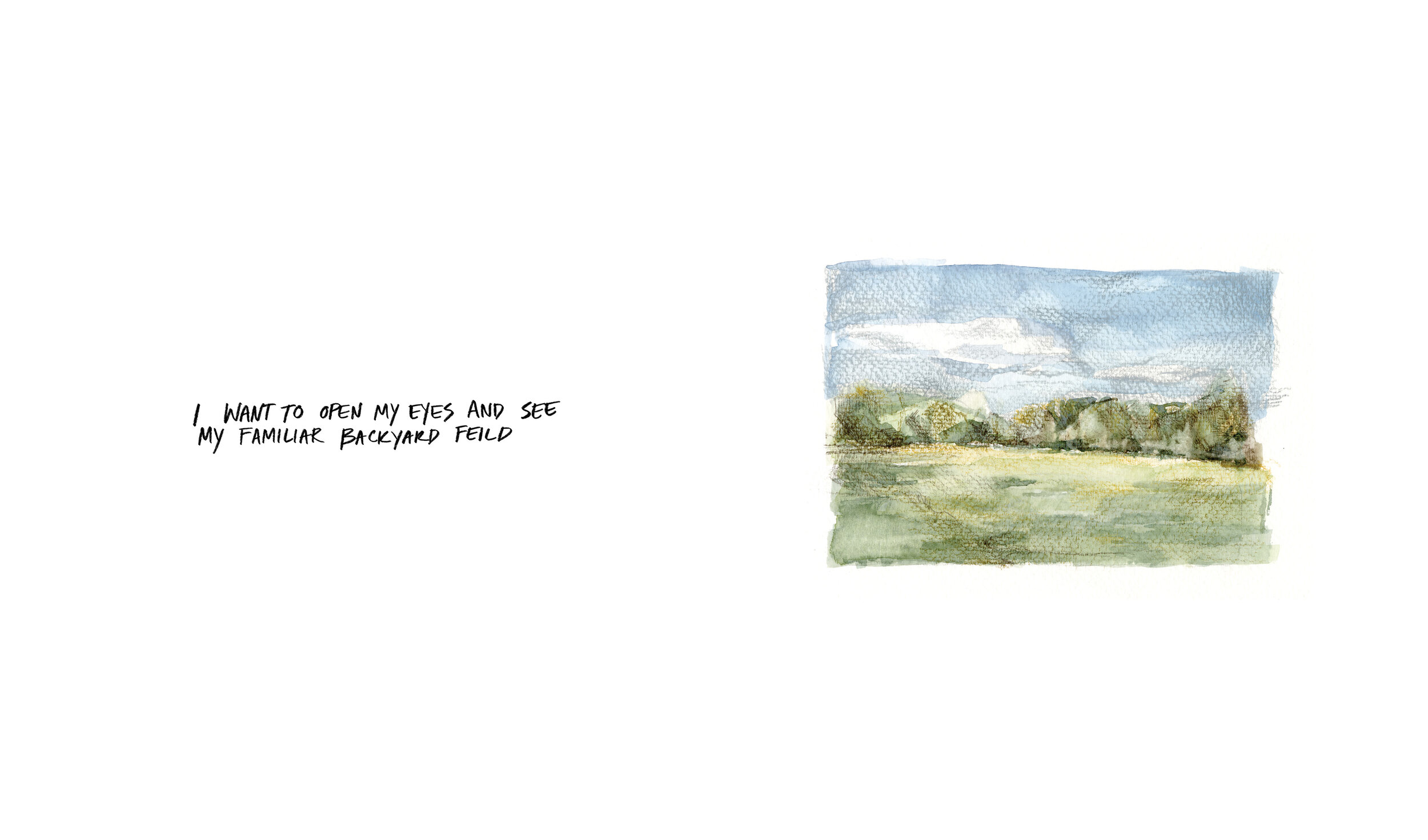
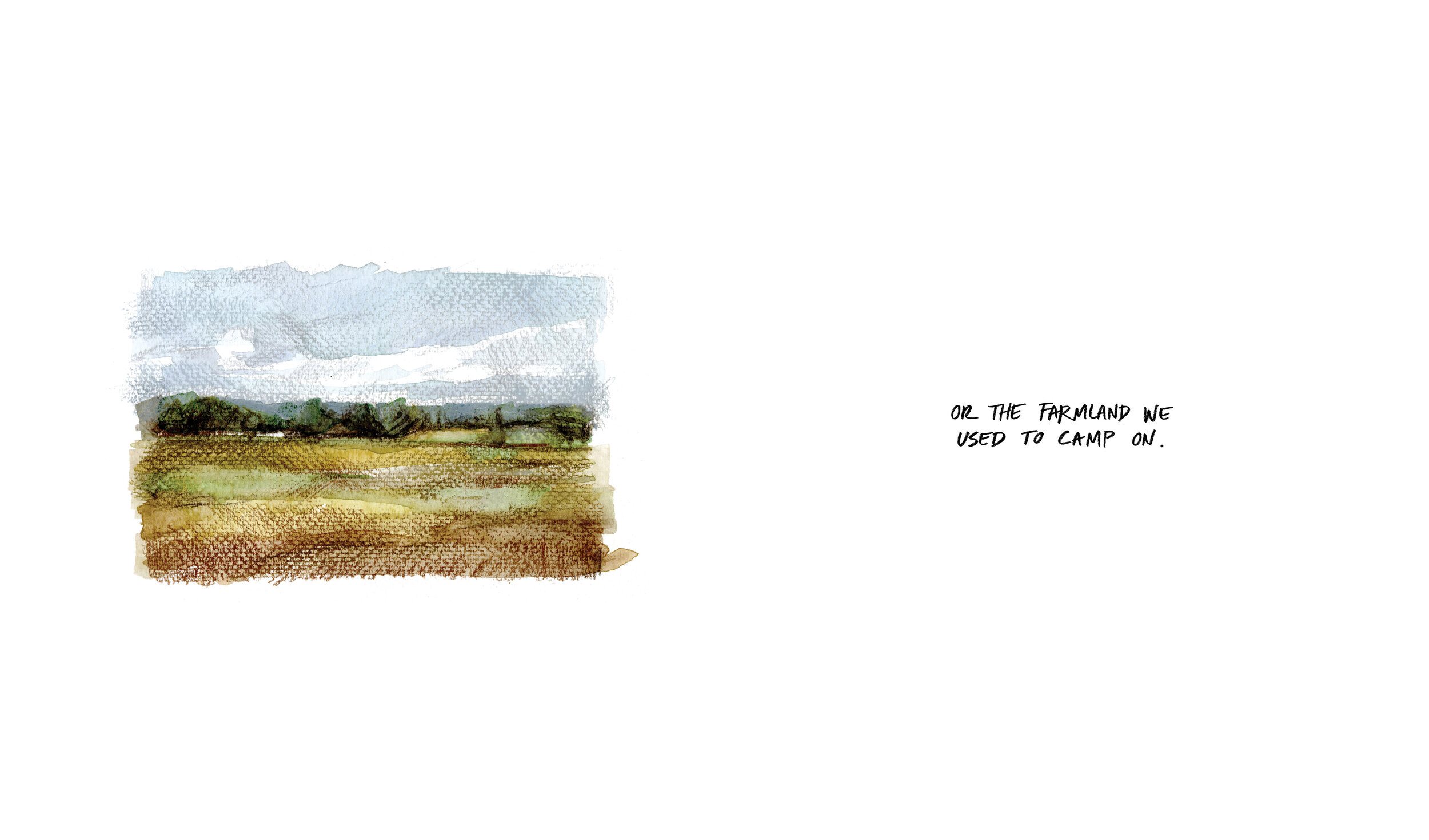
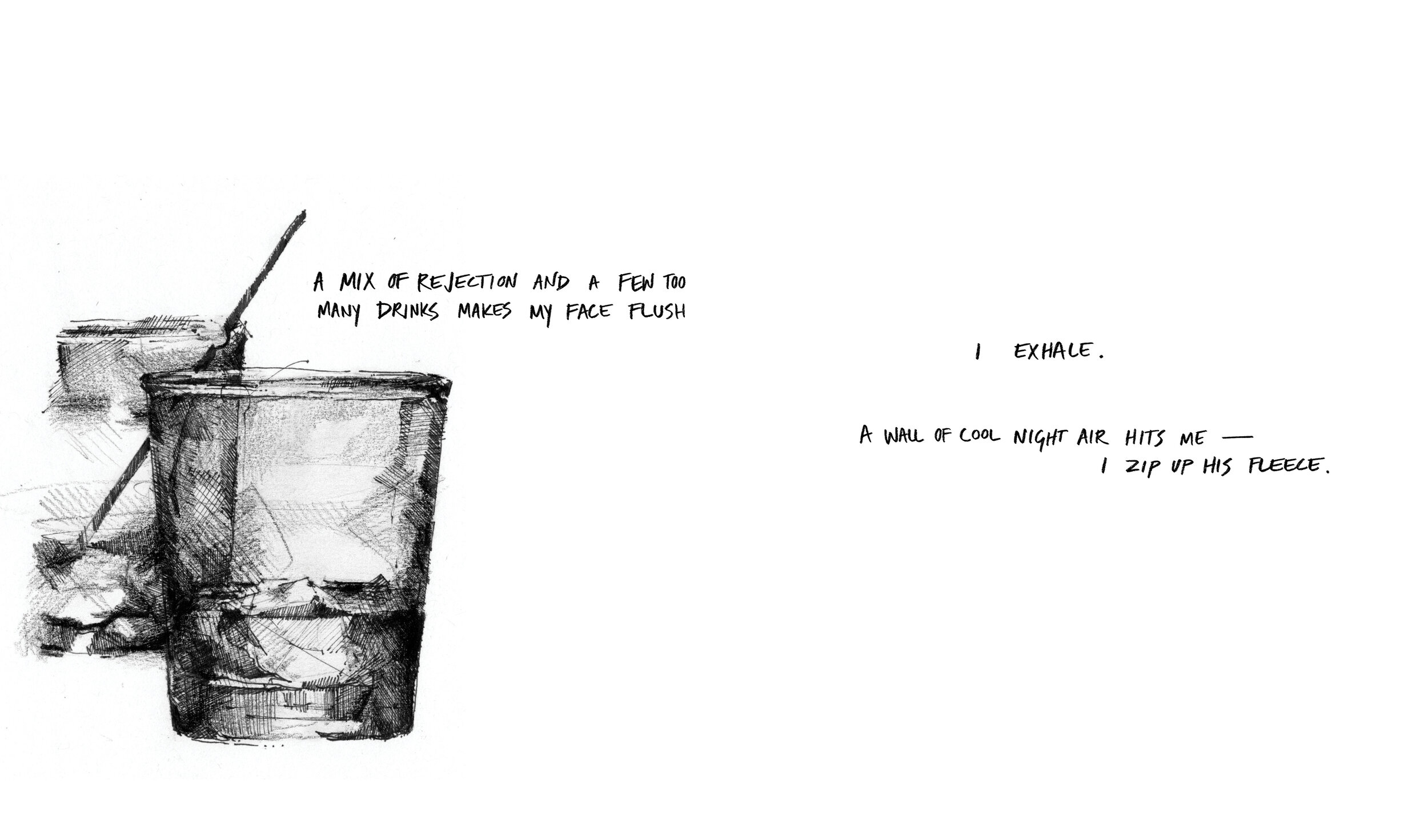
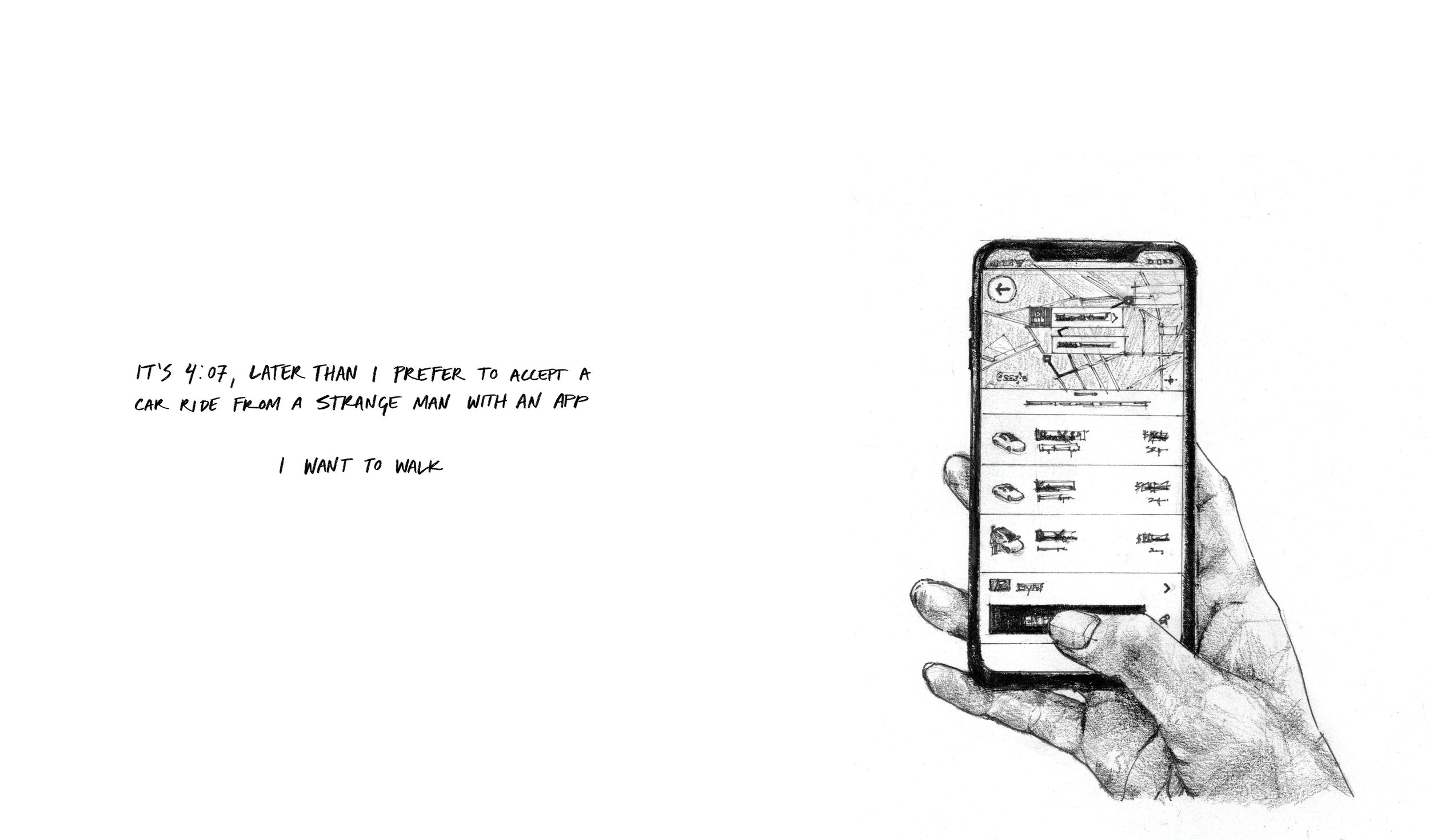
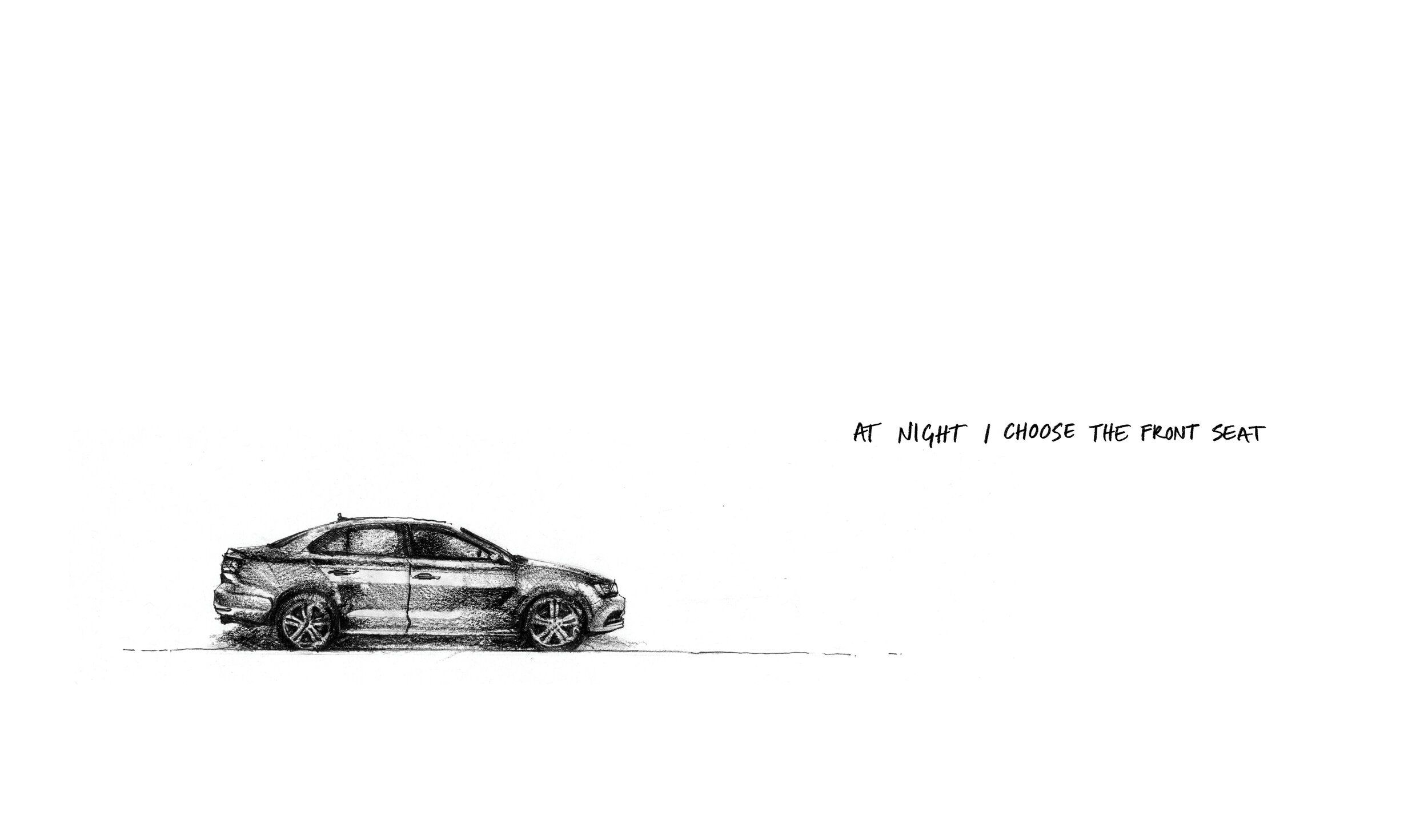
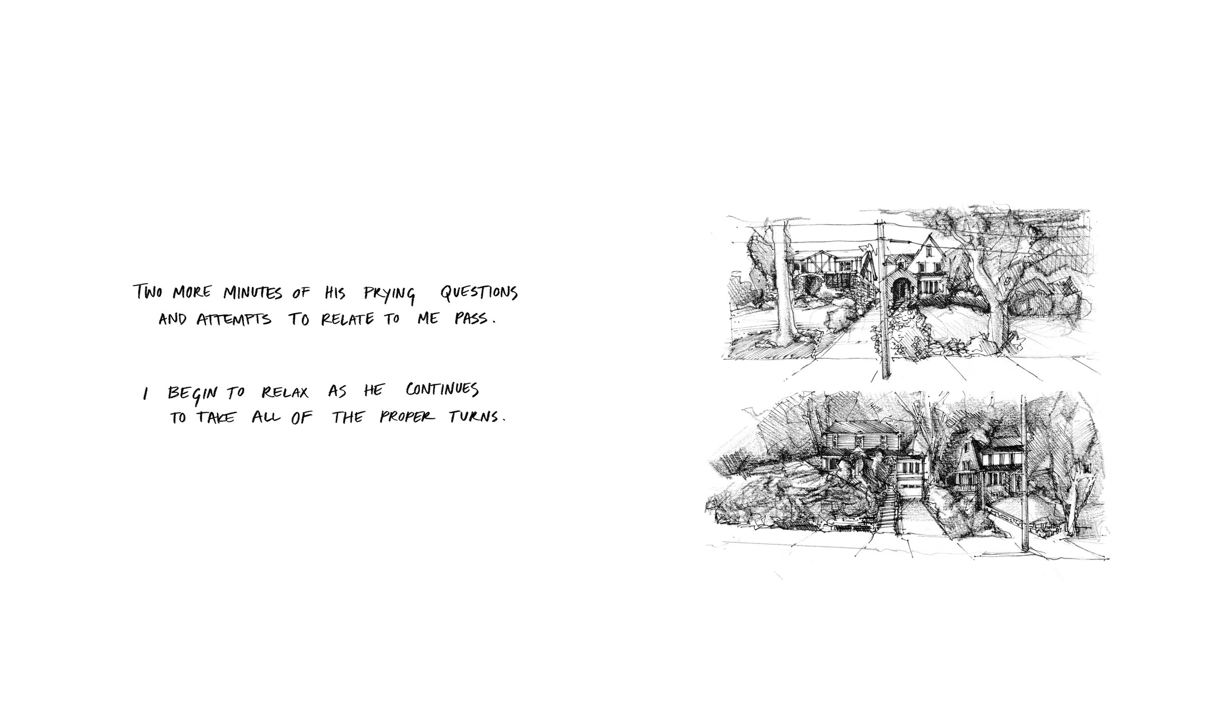
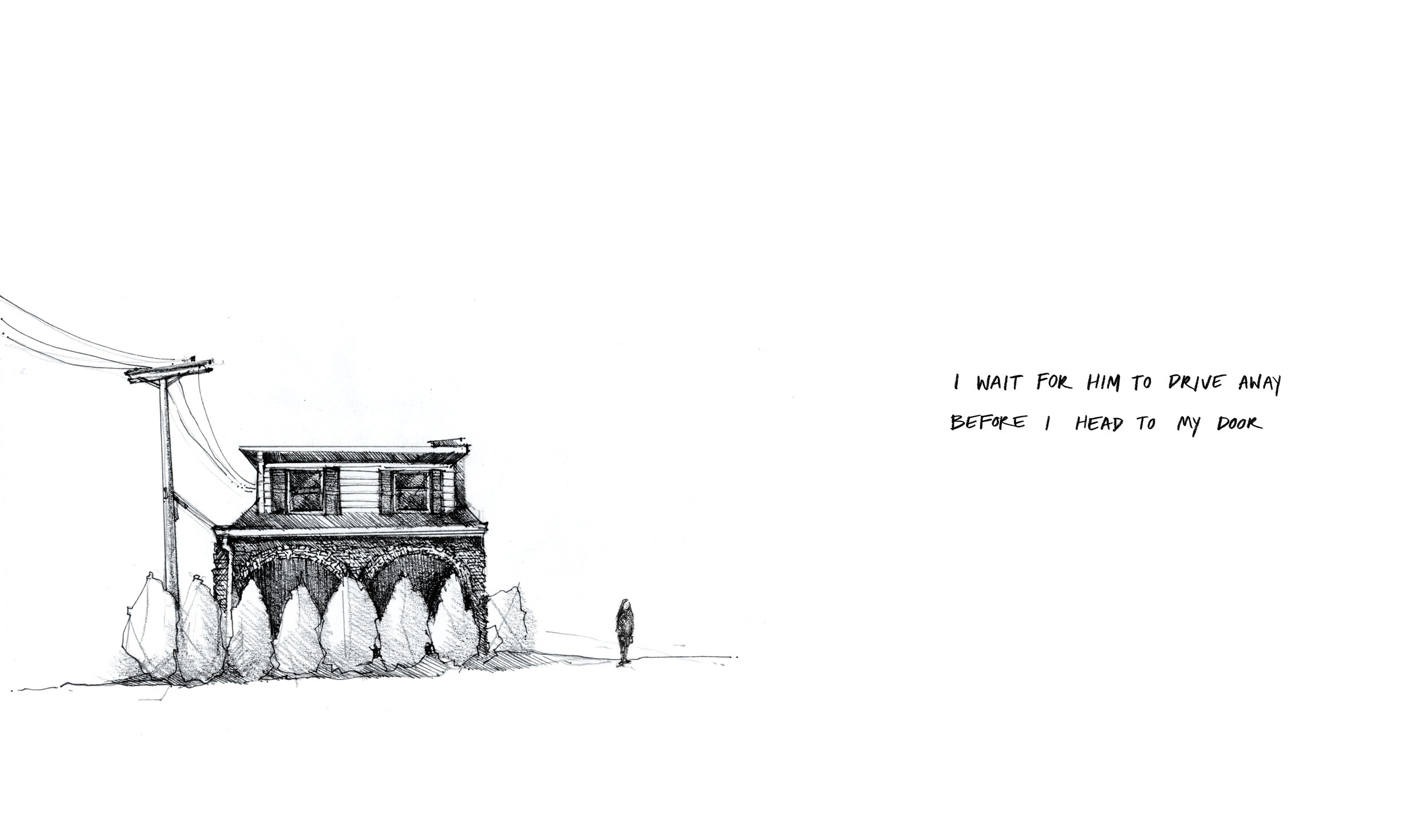
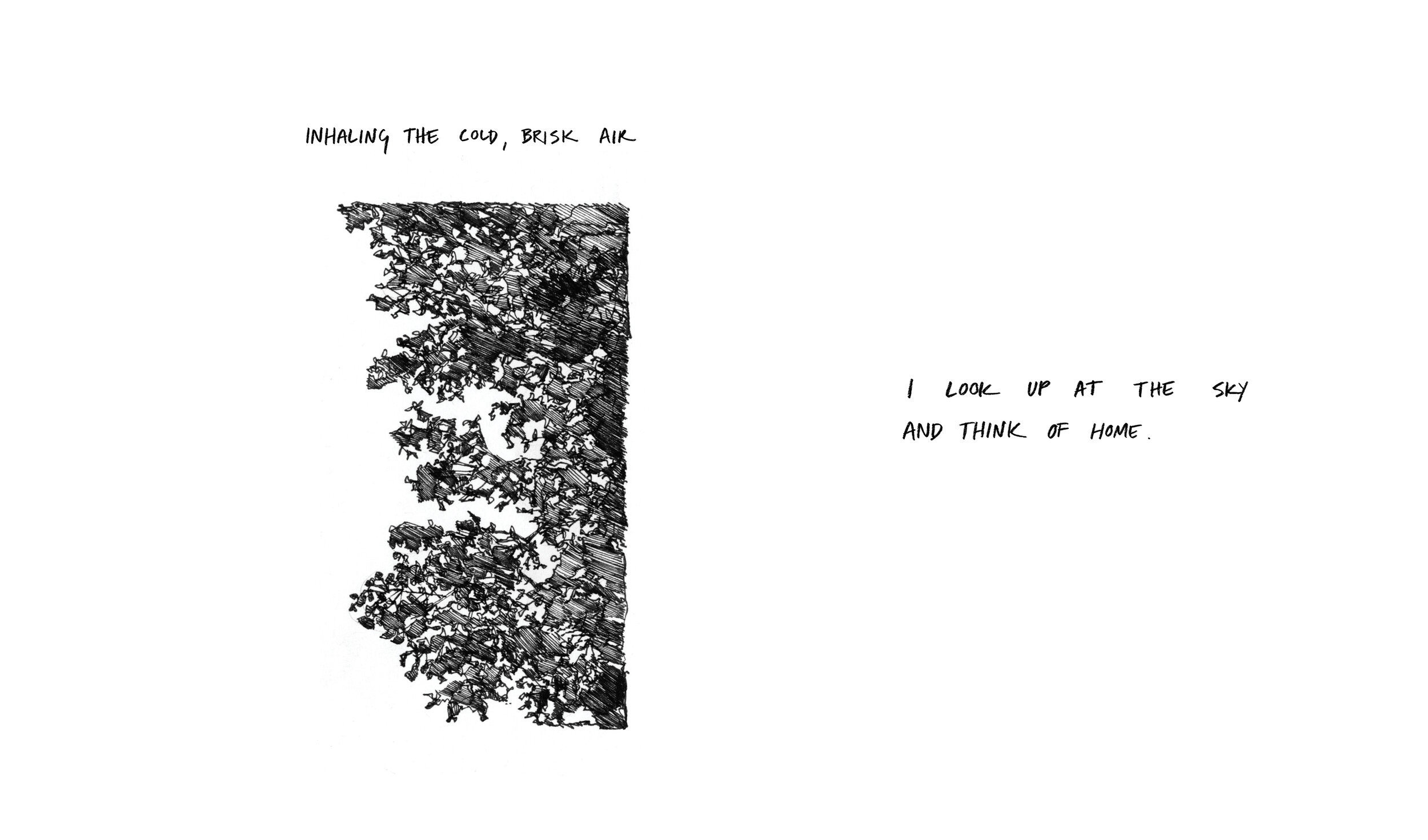
The first story of the book deals with feelings of loss and disorientation. Through the events and interactions of the night, I’m relentlessly pushed further away from where I'm comfortable, to a point of homesickness — longing for something I’ll never truly be able to go back to — the home of my memories, before adulthood, before the realities of womanhood set in.


Home Segment—
This segment uses a backlit slide and a glass optical to achieve the effect of a blurred, distorted memory. Only through peering directly into the lens does the scene come into focus — the further away the viewer is, the less clear the image becomes.
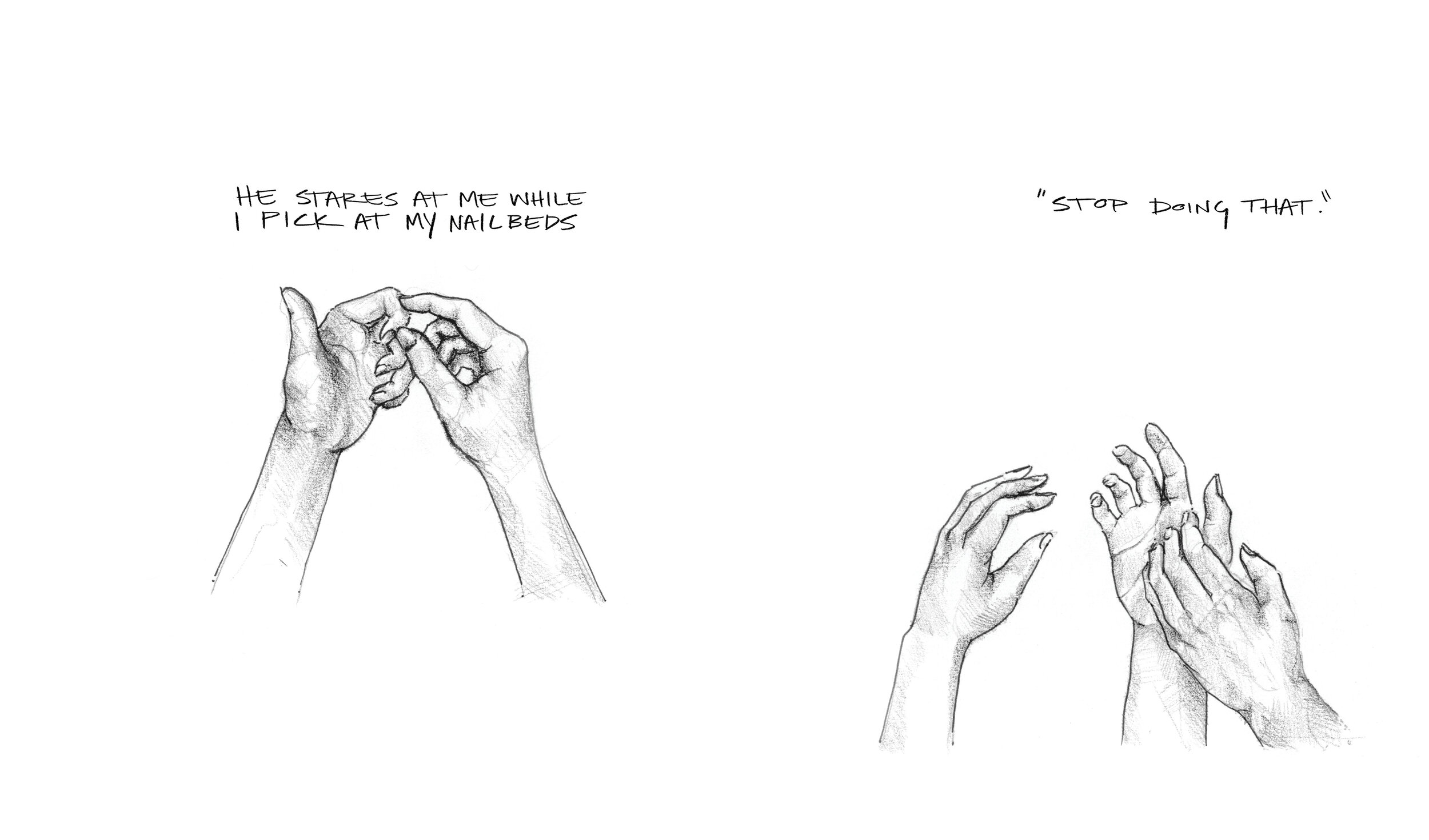
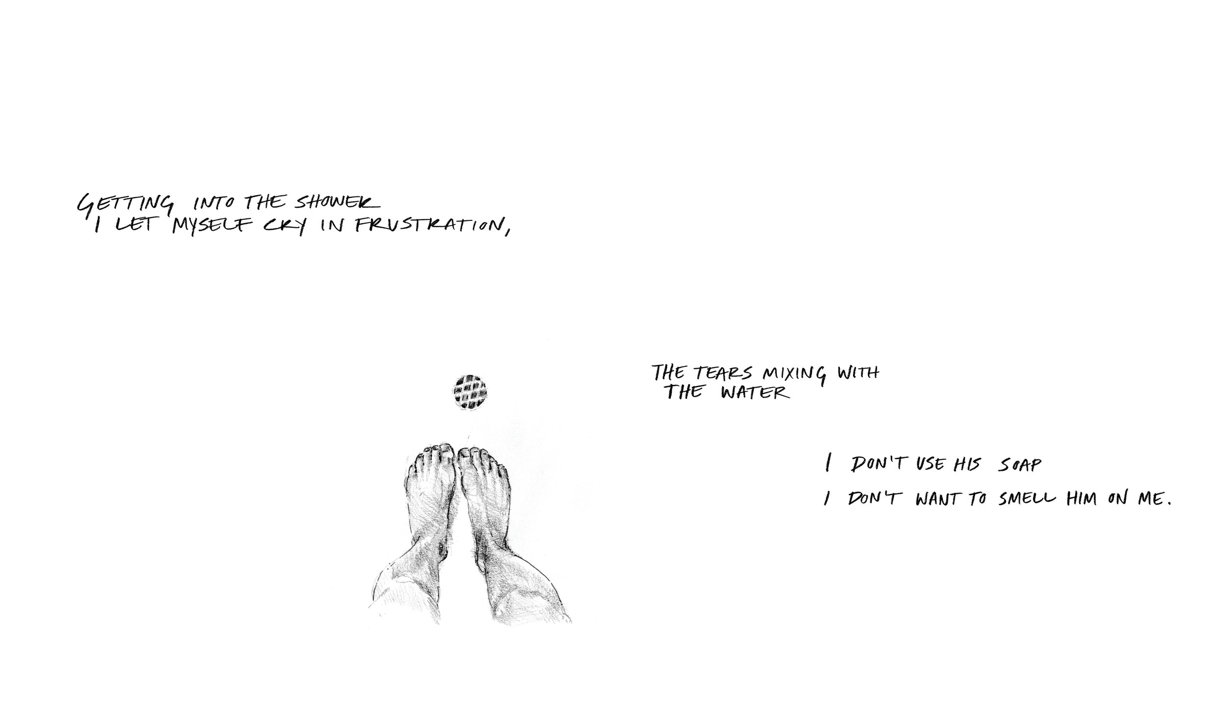
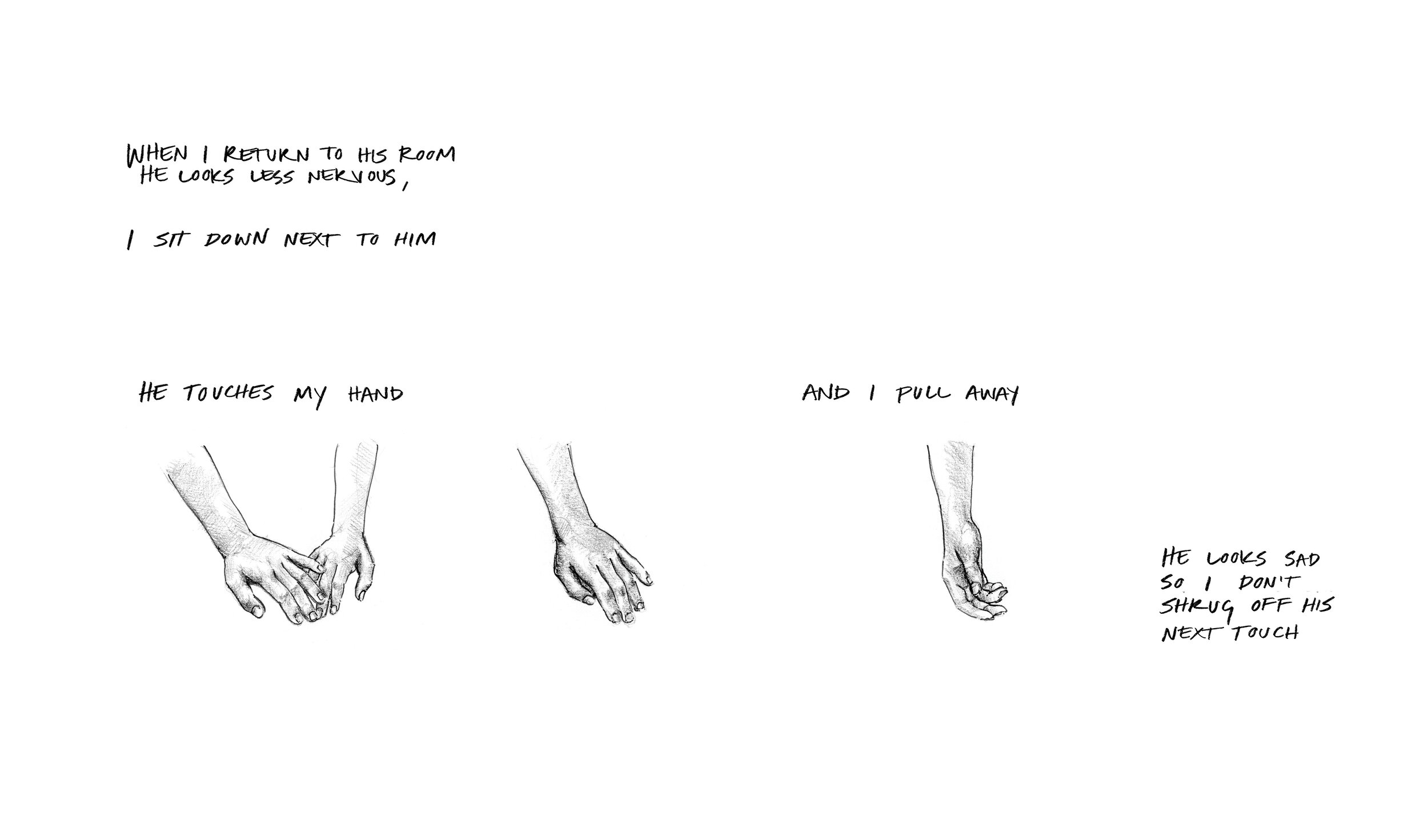
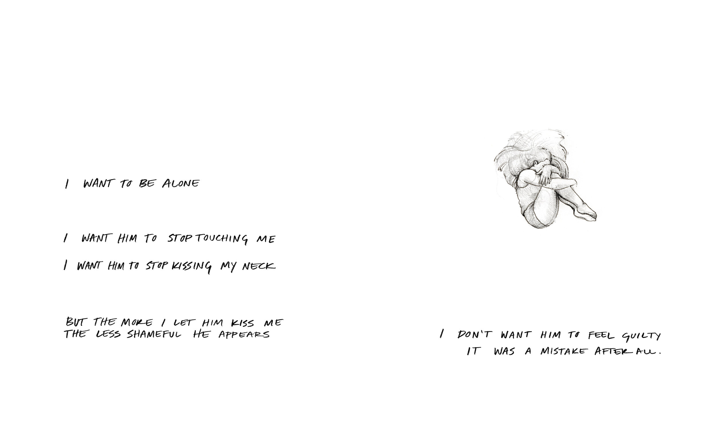
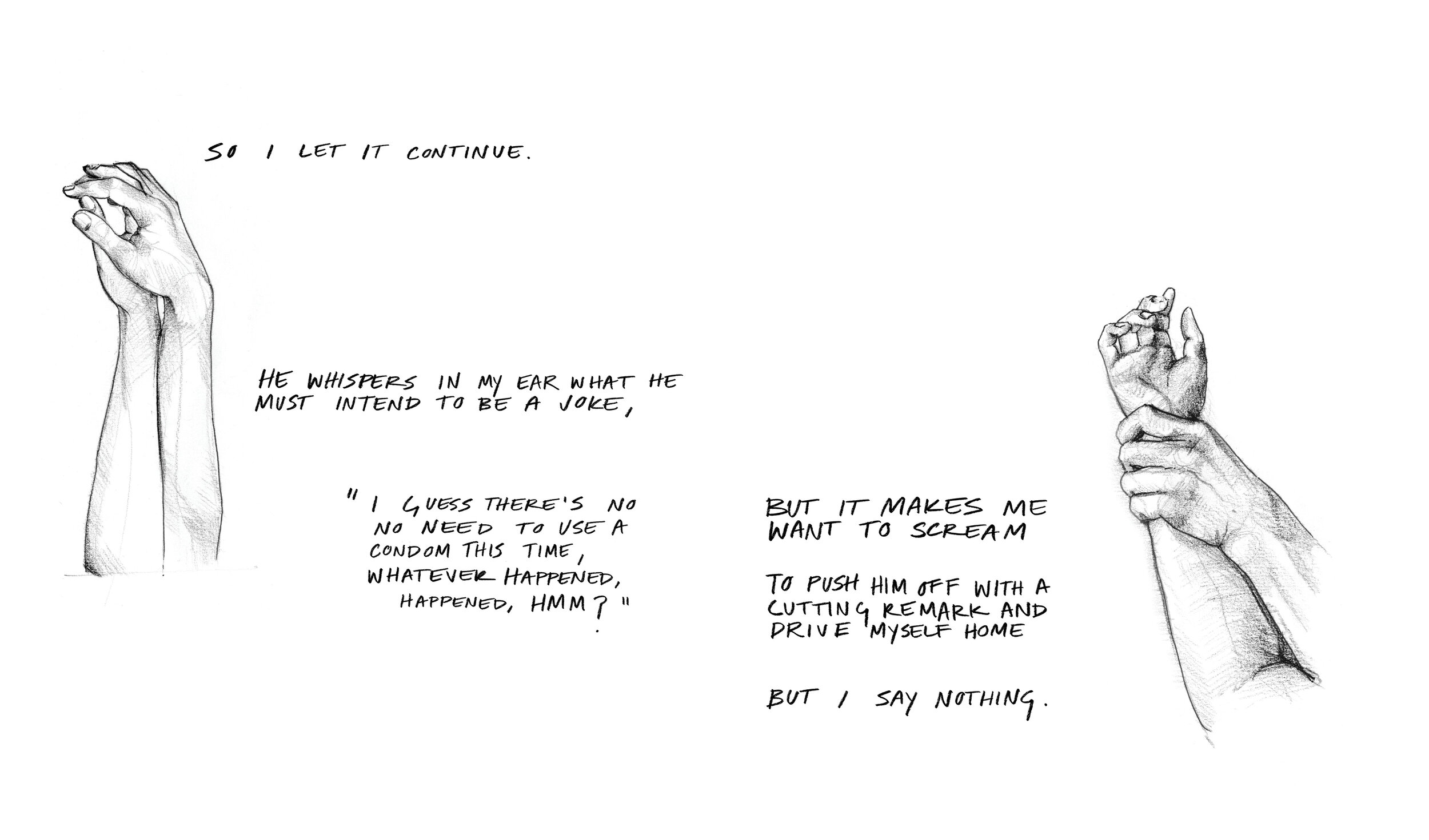
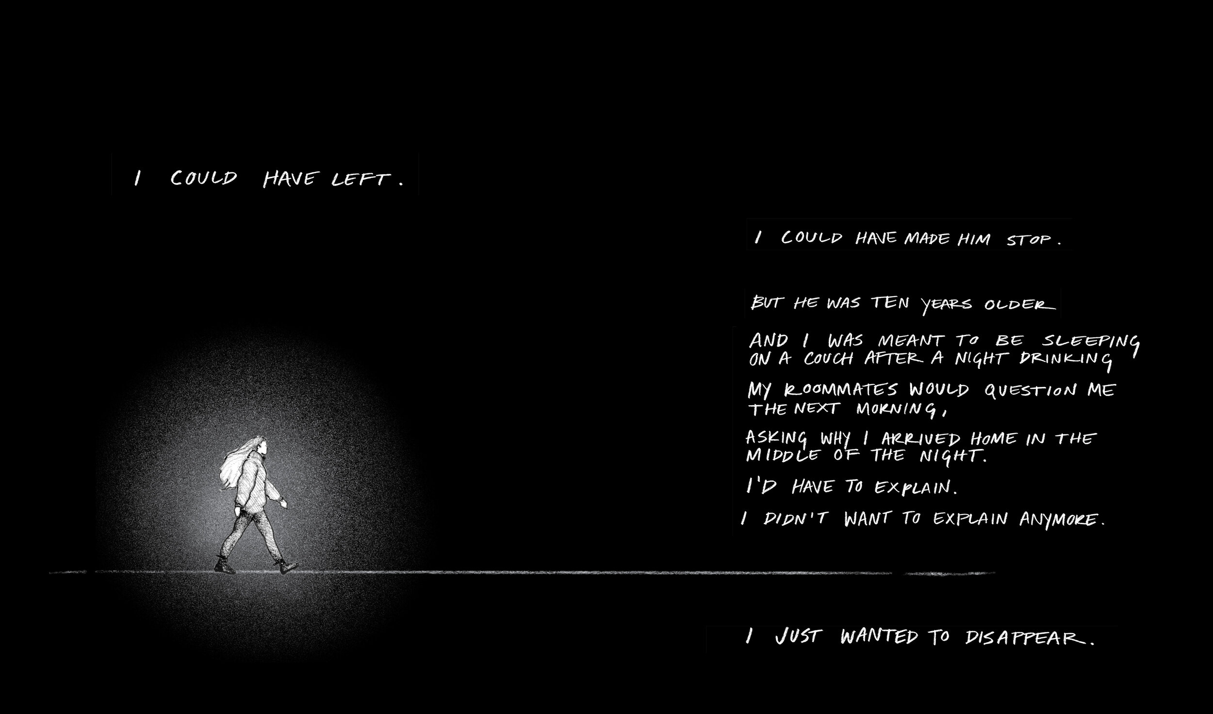
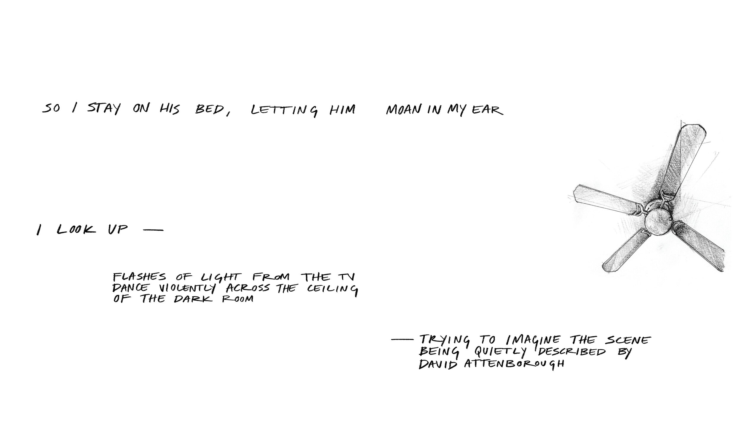
Blood—
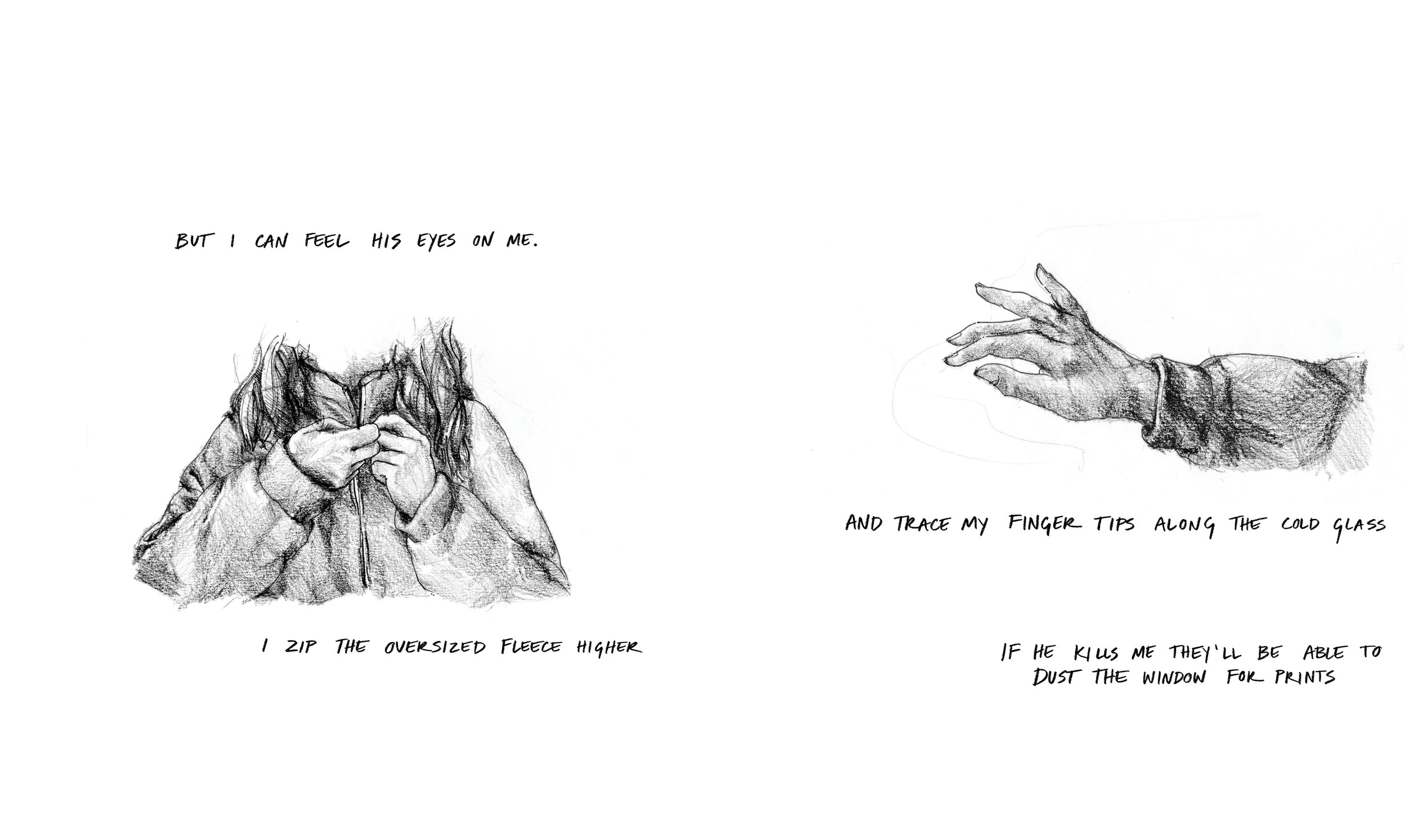
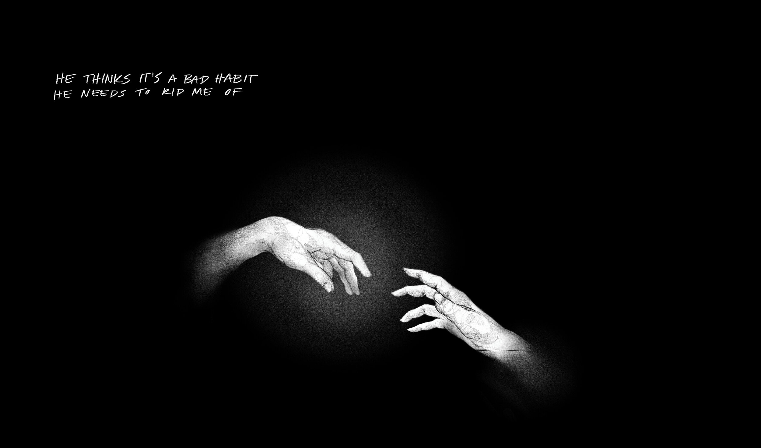
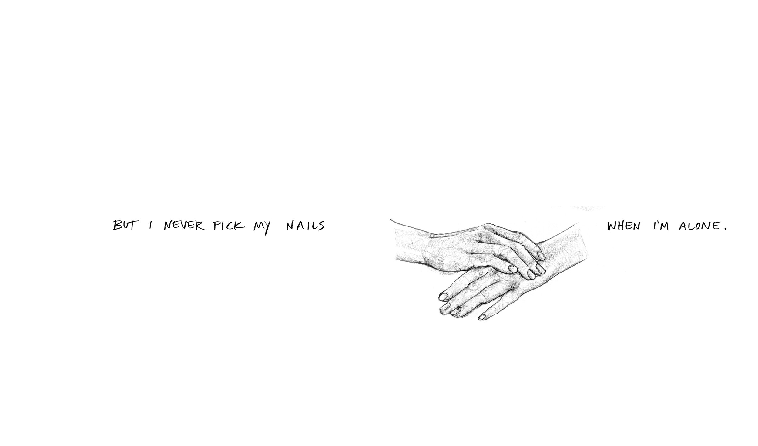
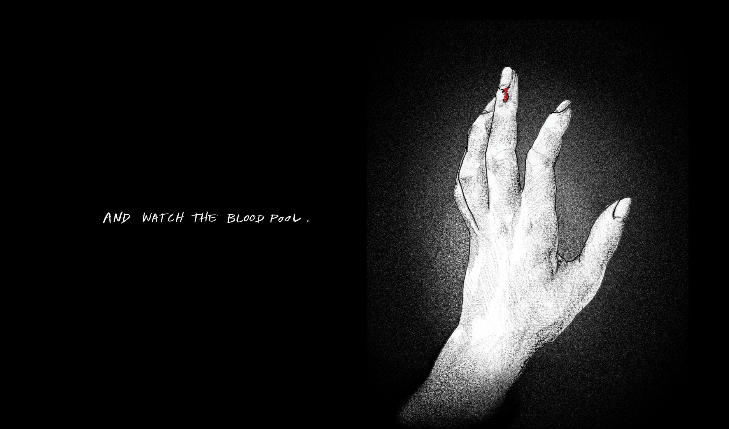
The second narrative explores the notion of control within relationships. The story tells of a common occurrence between a partner and I, in which he felt it was his duty to adjust my behavior and habits on the basis that it’s “what’s good for me.” By attempting to control my behavior, he repeatedly and subtlety, began to undermine my autonomy / sense of independence. The final two frames of the story depict my aggravated resistance.


Blood Segment—
for this segment I chiseled a small block of wood into a stake — representing the build up of small events resulting in internalized aggression

Planet Earth II—
The final story of the book explores jadedness and a loss of self. This story depicts a pivotal moment — realizing my actions may not always align with my beliefs. Through this realization, I see myself in a new light — one that is not quite as bright.


Planet Earth Segment—
Childhood toys sit below an elevated vile of dried flowers. The toys are painted white, representing the innocence and hopeful ignorance of childhood. The flowers, once fresh and connected to the earth, now sit dried in a specimen vile. In this story I yearn to live up who I thought I’d be, but am now presented with an older image of myself, more rooted in the harsh reality of my adult decisions.

Landscape Analysis —
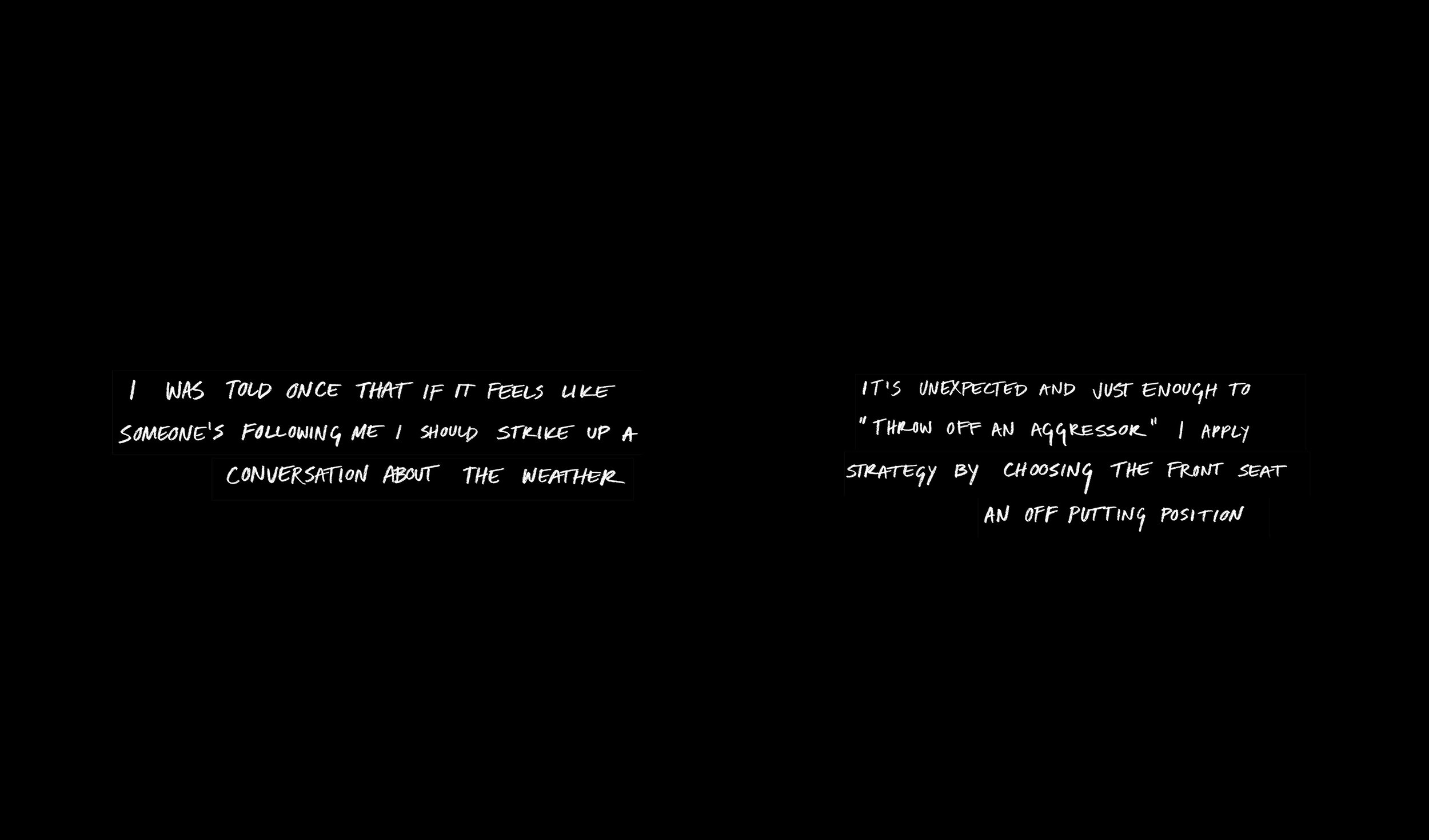
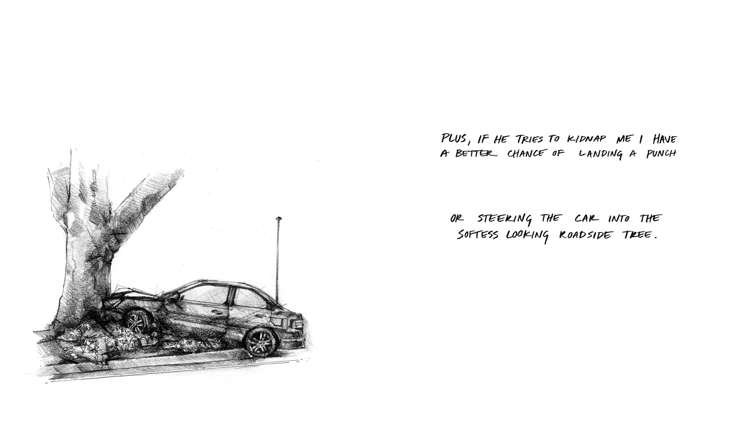
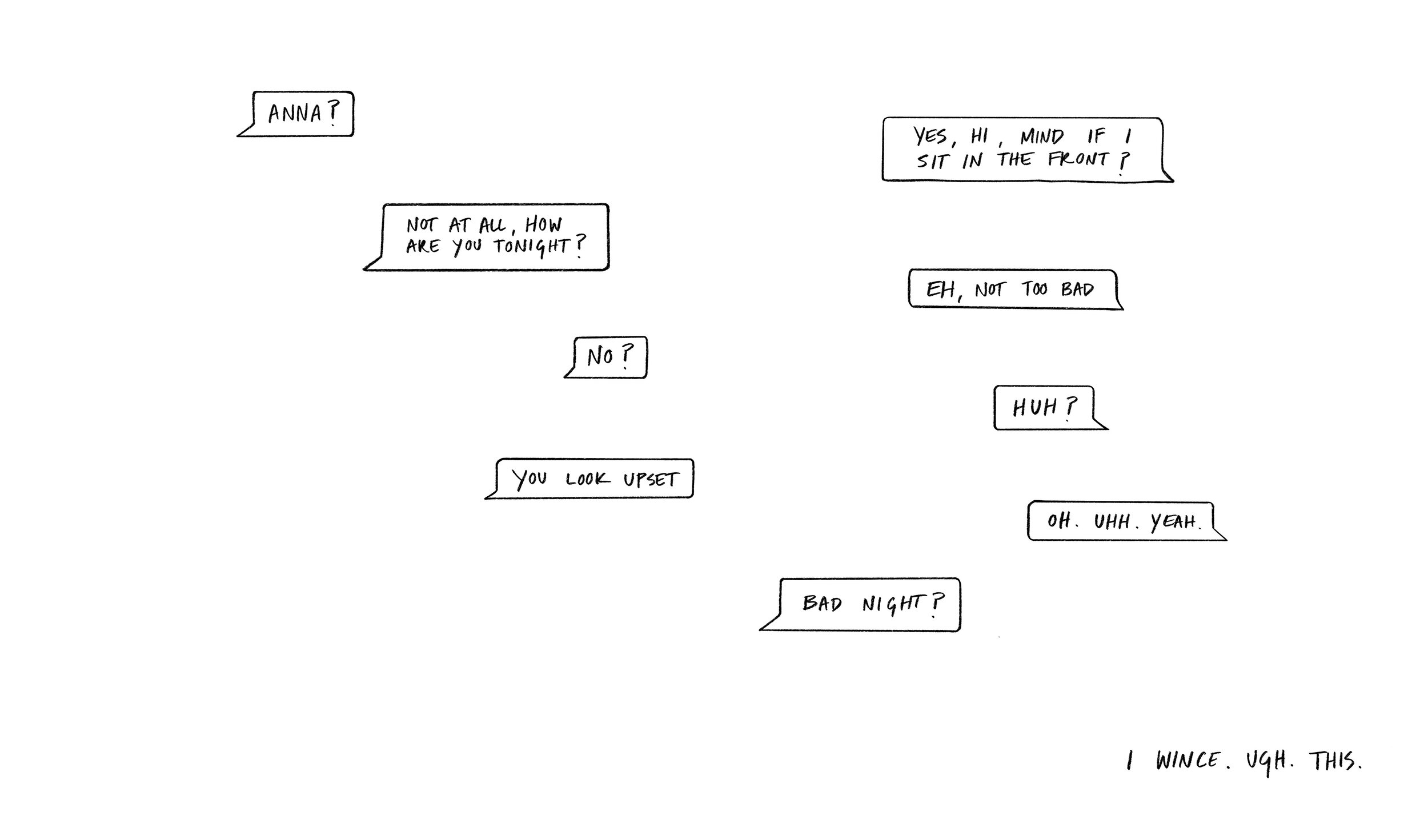
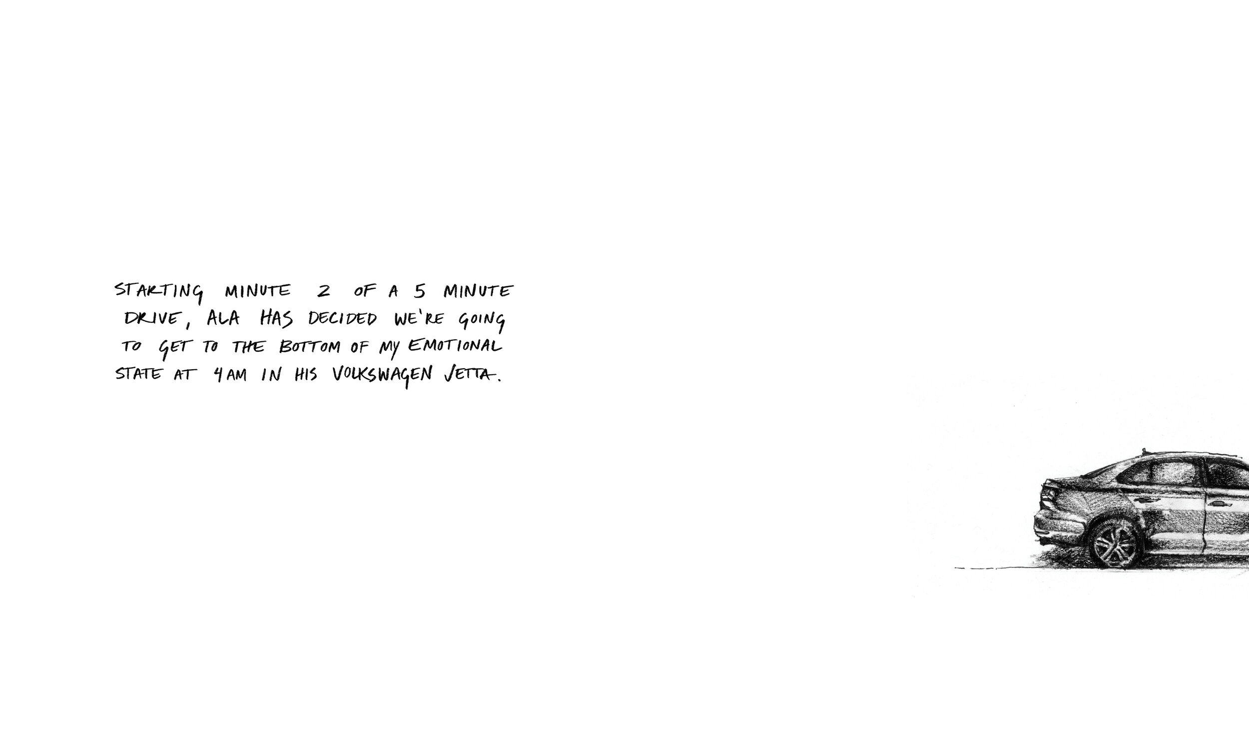
My topic area started off as being self defense and started the project off with a general analysis of existing product solutions. Through this, I noticed I quickly began to focus on the bottom-right section— products surrounding sexual assault / female-centric safety devices.
After having done this I realized that my topic simply being “self defense” was a bit too surface level. I felt I was missing something bigger, something that I knew existed but couldn’t yet put my finger on.
Personal Narrative—
A short, graphic story about some of my experiences with personal safety, specifically, as a woman. It was only after creating this piece that I realized I’d very likely be producing something about womanhood.
Through this first exploration I began to understand how impactful hand drawn imagery could be when relaying personal stories — to me, it creates a sense of intimacy between the creator and the reader. The hand drawn aspect was something I embraced through this process (as it also is a huge part of my design practice). I wanted to convey a sense of individuality — as if someone was looking into a journal of sorts — that allowed a viewer to connect with my work in a more human-to-human kind of way.
(click the images below to enlarge)

Can I encourage reflection through my own vulnerability?
Poster Set—
Incorporating feedback from the previous round of communication-style making, I produced two large poster that utilize scale, color (dark), bold language (visually and definition-wise), and abstract imagery to draw in those who pass by. The goal was the peak interest with a bold yet vague tagline at the top. Once someone has begun to read the fine print (handwritten), the story unfolds and the previously abstract imagery quickly relates to a disturbing, personal story about safety and sexual assault.
Can abstract imagery serve as a more intriguing and powerful entry point to the content?


How do I create a more intimate interaction with these stories?
How can I relay complex feelings with form?
Scrolling Narrative—
This piece highlights the association of a specific object with a moment of distress — to the point that the object itself is triggering. For this relation to be clear, I used just one specific item framed in a shadow box, intentionally pinned up like a scientific specimen to physicalize the feeling of repeated reflection / examination.
The use of the small box creates an intimate experience with the object as you’re forced to look deeper in to see or read the story. It’s a one person object with the intent that the viewer will hold it in their lap when engaging. To move the narrative blurbs along — all events from my own experience — the dowel rods must be twisted simultaneously, sometimes covering the object inside with a solid color or text, while other times fully or partly revealing it.
While my own connection to the imagery holds more meaning than just a sexual experience (often times relating to negative emotions or relationships surrounding those experiences), an outside viewer may see the use of a condom wrapper as a bit heavy handed, and thus, more quickly dismiss the work. I decided in further exploration to use more abstract symbols as an entry point for content.
Sweet 16 Birthday Box—
A gift-box for entering the “adult” world as a woman. Some objects may seem mundane, connected to an obvious use, but through reading the short description within the guide, a deeper meaning emerges. Each object plays a role in self defense — be it the traditional sense of the term (I.e. physical protection) or a more nuanced definition (I.e. emotional protection / coping mechanisms).


A selection of excerpts from the written guide:
Key—
Pepper spray can give off a ~paranoid~ vibe. Don’t wanna ruin your “chill” image? Simply have this ready to stick between your knuckles for a wolverine style attack
Tampon—
Not ready? Just feeling weird? Haven’t learned to verbalize your needs and boundaries yet? An age old excuse with a 75% success rate on older men and a 100% success rate on with younger men. Simply mutter, “I’m on my period…”
Hair Tie—
A fidget device to help you avoid eye contact. Put to use while weighing the pros and cons of a hookup or thinking of an excuse to get home, the possibilities are endless!
Juul / Lighter—
Not only is it a great social crutch for a night out, but the guided breathing (and resulting nicotine) might ease your nerves. Fucking up your lungs can give you a strange sense of ownership over your body (assuming that’s gone by now)!
What everyday objects hold more complex meaning due to my experiences as a woman?
What does it mean to defend yourself?

“Storyboard”—
This was a very big step toward one of my two final deliverables. The content as well as the visual style —black and white color pallet paired with abstract imagery and handwritten text— were key to informing my final illustrations.
The struggles I faced with this work helped me plan more effectively for the next phase. To avoid line weight inconsistencies in the final, I chose to use only two weights of black pen and Prismacolor black pencil. To avoid uncomfortable scale shifts, I formatted all of the layouts before creating final version of the illustrations. Having a general guide helped me to maintain my initial vision and stopped me from getting caught up in any drastic visual alterations halfway through the book.
How can I connect my experiences to a larger audience?
Which experiences can others see themselves and their own stories in the most?
Inspiration for Physical Component—

A Moment Here by Mari Andrews

Tear Gun by Yi-Fei Chen

Lightboxes by Juanan Requena
Creating the Book—


Construction of the Walnut Container—


Creating the Interior Components—


Public Response—
This project was on display during Final_FINAL_v36 copy.show, the Class of 2020’s senior design show (pictured to the right, featuring Serina Liu).
Within the “Leave us feedback for our next iteration” interaction for visitors, around ten comments mentioned specific works. Out of those ten comments this project was mentioned twice (and after triple checking— confirmed neither of those were written by my close friends or family)!
Creating this piece challenged me in to speak openly about my personal experiences. I was driven by the hope that through this vulnerability, others would be able to connect to the work in a more meaningful way. Seeing that this work was able to register with people, even when standing alone, was incredibly fulfilling.


Full Stories—
Below are full versions of each personal narrative. The book in whole is titled Blood / Home / Planet Earth II as to avoid defining a reader experience or take away with an “all-encompassing” title.